Colors have relationships with one another, and one of the easiest ways to understand those relationships is by looking at the color wheel.
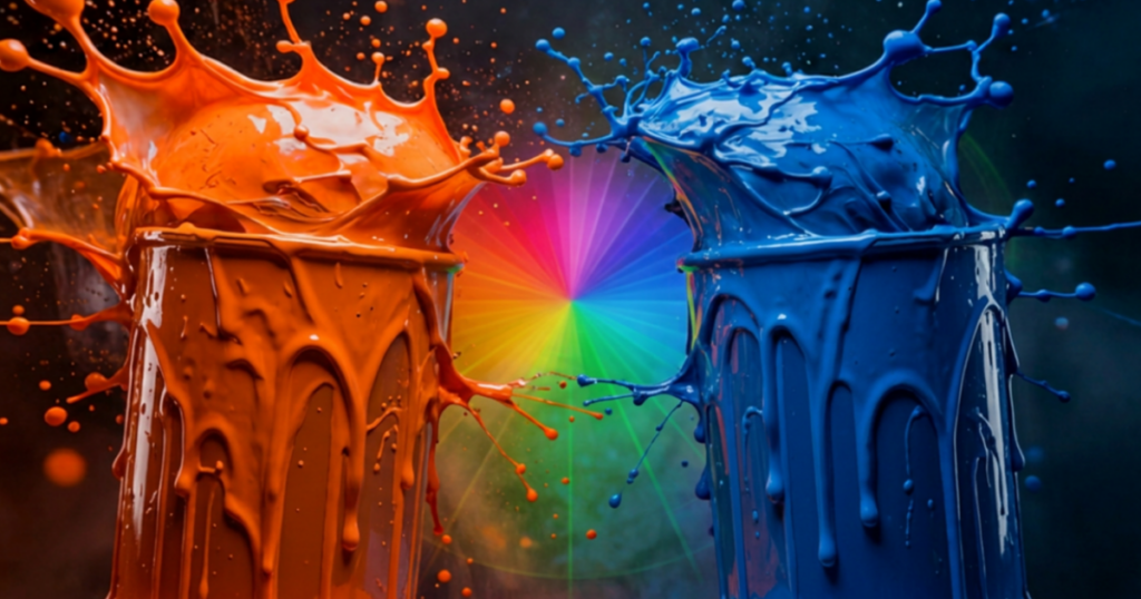
If you’ve ever wondered what color is the opposite of orange, the answer is blue.
On the color wheel, orange and blue sit directly across from each other, making them complementary colors. These two colors naturally create contrast and balance, which is why they are often used together in art, interior design, and decorating.
What Color is Opposite of Orange on the Color Wheel?
The opposite of orange on the color wheel is blue. A traditional color wheel includes three primary colors:
- Red
- Yellow
- Blue
Secondary colors are created by mixing primary colors:
- Orange = Red + Yellow
- Green = Yellow + Blue
- Purple = Red + Blue
Because blue sits opposite orange, it is considered orange’s complementary color.
Why Are Orange and Blue Complementary Colors?
Complementary colors create contrast because they have different visual properties.
Orange is:
- Warm
- Energetic
- Bright
Blue is:
- Cool
- Calm
- Relaxing
When placed together, they create a balanced combination where each color helps the other stand out. This is why you often see orange and blue used in: interior design, branding, artwork, and fashion.
What Colors Go With Orange?
While blue is the direct opposite of orange, other colors can work beautifully with orange depending on the look you want to create.
Orange and Blue
The classic complementary pairing works well for:
- High contrast designs
- Accent walls
- Statement pieces
Examples:
- Navy blue + warm orange
- Soft blue + muted terracotta
Orange and Neutral Colors
Orange pairs naturally with neutrals because they soften its intensity. This is especially popular in home design because it creates warmth without feeling overwhelming. Great combinations include:
- Orange + cream
- Orange + beige
- Orange + warm gray
Orange and Green
This combination often feels organic and inspired by nature. Orange and green create a natural, earthy palette. Think:
- Terracotta
- Olive green
- Sage green
What is the Opposite of Burnt Orange?
Burnt orange is a deeper, more muted version of orange. Its opposite is still technically blue, but the best pairing depends on the undertones. For example:
- Burnt orange → navy blue
- Terracotta orange → dusty blue
- Rust orange → blue-green tones
The more muted the orange becomes, the softer the complementary color can become.
Using Orange and Blue in Interior Design
Orange and blue can be used together in many ways.
For Living Rooms you can try:
- Blue walls with orange accents
- Orange décor against neutral walls
- Blue furniture with warm wood tones
For Bedrooms, a softer approach works best:
- Dusty blue walls
- Terracotta textiles
- Warm neutral accents
For Kitchens, orange tones can appear naturally through:
- Wood finishes
- Copper accents
- Warm tile paired with cooler blue accents
Colors Similar to Orange’s Complementary Blue
If you love the contrast of orange and blue, consider exploring blue paint colors like:
- Benjamin Moore Hale Navy HC-154
- Benjamin Moore Newburyport Blue HC-155
- Benjamin Moore Van Courtland Blue HC-145
For a softer look, lighter blues can create a more relaxed palette.
Final Thoughts
Whether you’re designing a room, choosing paint colors, or creating a color palette, understanding complementary colors makes it easier to create combinations that work beautifully together.
Need help choosing the right paint colors? Visit our local paint stores throughout Queen, Brooklyn and The Bronx for Benjamin Moore colors and expert guidance.