Benjamin Moore Palladian Blue (HC-144) is a soft blue-green paint color known for its calm, airy feel. It blends blue, green, and gray undertones to create a soothing coastal-inspired color that works beautifully in bedrooms, bathrooms, and living spaces.
If you’re considering Palladian Blue for your home, understanding its undertones, Light Reflectance Value (LRV), and where it performs best can help you decide if it’s the right color for your space.
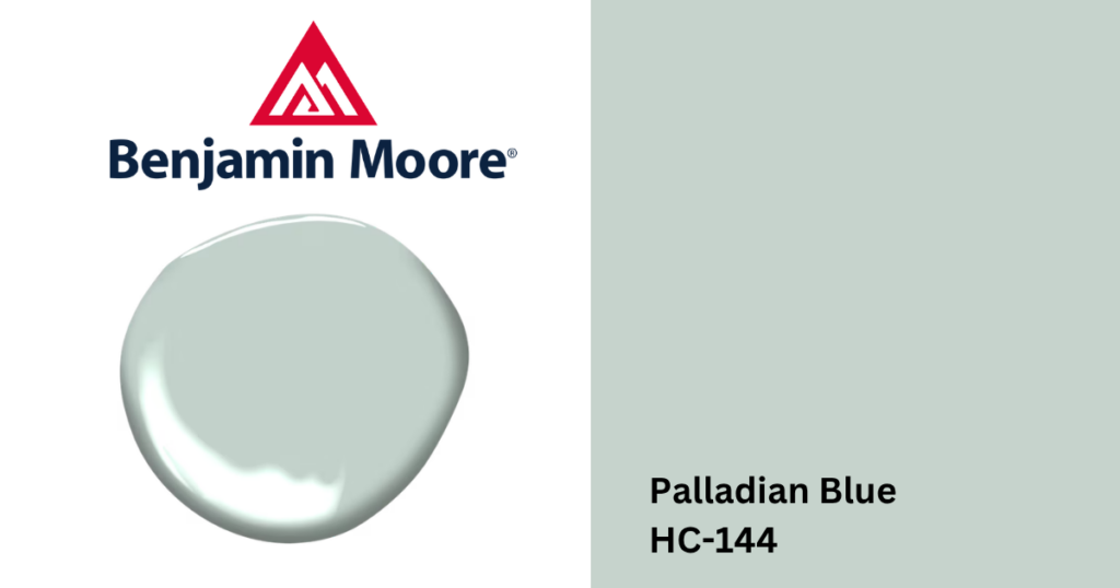
What Color Is Benjamin Moore Palladian Blue?
Benjamin Moore Palladian Blue is a light blue-green with soft gray undertones. Because it sits right between blue and green, it can shift depending on lighting and surrounding materials.
In bright natural light, Palladian Blue tends to show more of its blue side. In warmer lighting it can lean slightly greener. This versatility is one reason the color remains a favorite among homeowners and designers.
Benjamin Moore Palladian Blue Undertones
Palladian Blue has blue, green, and subtle gray undertones. These undertones give it a soft, muted quality that keeps it from feeling overly bright or saturated.
How the undertones appear can vary by lighting:
- Natural daylight: fresh blue-green
- Warm lighting: slightly greener and softer
- Cool lighting: more blue and airy
Because of these shifts, Palladian Blue often feels calm and relaxing rather than bold or dramatic.
Benjamin Moore Palladian Blue LRV
The light reflectance value (LRV) of Palladian Blue is 61.17. This places it in the medium-light range, meaning it reflects a good amount of light while still offering noticeable color on the wall.
With an LRV in the 60s, Palladian Blue works well in:
- bedrooms
- bathrooms
- kitchens
- living spaces
Where Benjamin Moore Palladian Blue Works Best
Palladian Blue is often used in spaces where homeowners want a relaxed, tranquil atmosphere.
Bedrooms: The soft blue-green tone creates a peaceful environment, making it a popular choice for primary bedrooms and guest rooms.
Bathrooms: Palladian Blue works beautifully in bathrooms where its coastal feel pairs nicely with white tile, marble, and chrome fixtures.
Living Rooms: In living areas, it adds subtle color without overwhelming the space, especially when paired with neutral furniture and natural textures.
Dining Rooms: For homeowners looking for something more interesting than a neutral, Palladian Blue can bring a fresh and elegant feel to dining spaces.
Colors That Pair Well With Palladian Blue
Because of its balanced undertones, Palladian Blue pairs well with many colors.
Common combinations include:
- crisp white trim
- warm wood flooring
- soft greiges
- sandy beige tones
- brushed brass accents
For trim and ceilings, many homeowners pair it with classic whites like Benjamin Moore White Dove.
Palladian Blue vs Other Soft Blues
Compared to more traditional sky blues, Palladian Blue feels softer and more sophisticated because of its gray-green influence.
For example, Benjamin Moore Swiss Coffee is a warm off-white often used alongside colors like Palladian Blue to create balanced palettes with both warmth and color. This combination works especially well in coastal, transitional, and traditional homes.
What This Means for You
If you’re looking for a calming color that sits between blue and green, Palladian Blue is a versatile choice. Its soft undertones and moderate LRV allow it to brighten spaces while still adding personality.
If you’re considering Palladian Blue for your next project, stop by one of our paint store locations near you to see the color in person and speak with our trained team members. We can help you test samples and find the right colors to complement it throughout your home.