The Mona Lisa is one of the most famous paintings in the world. But beyond its mystery and global recognition, it also holds valuable lessons about color, layering, and technique that still influence design today. So first, the straightforward answer:
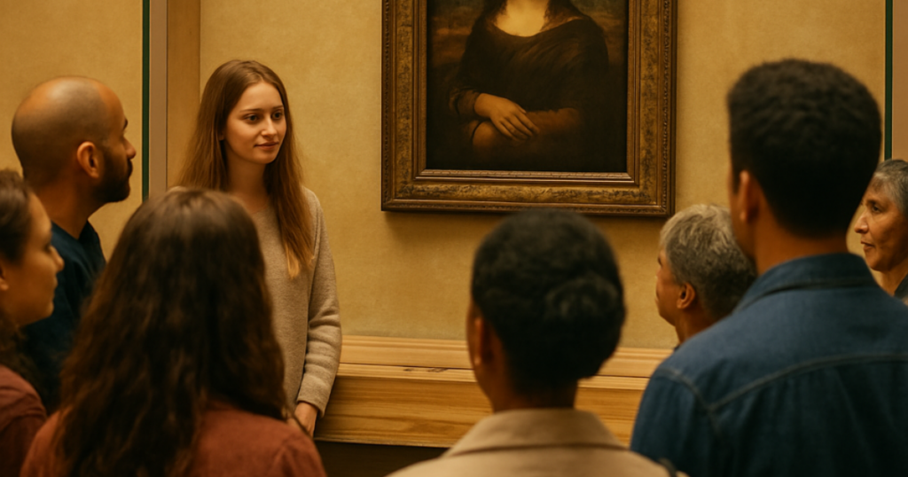
The Mona Lisa was painted by Leonardo da Vinci in the early 1500s. Today, it hangs in the Louvre Museum in Paris and remains one of the most studied works of art in history.
But what makes it so powerful — and what can homeowners and designers learn from it? Let’s look deeper.
Who Was Leonardo da Vinci?
Leonardo da Vinci wasn’t just a painter. He was an inventor, scientist, engineer, and master of observation. What set him apart wasn’t bold color — it was restraint.
The Mona Lisa isn’t filled with bright pigments or dramatic contrast. Instead, it relies on subtle transitions, depth, shadow, and layered tone. And that’s where the real lesson begins.
The Technique Behind the Mona Lisa: Layering and Sfumato
Leonardo used a painting technique called sfumato, which means “smoky” in Italian. Instead of harsh lines or defined edges, he built up extremely thin layers of translucent paint to create:
- Soft transitions between light and shadow
- Natural skin tones
- Atmospheric depth
- A lifelike, dimensional appearance
There are no visible brushstrokes. No hard outlines. No abrupt color breaks. Everything blends. This principle of layering and subtle variation is something we see echoed today in architectural finishes.
What the Mona Lisa Teaches Us About Color
1. Depth Comes From Layers — Not Just Bold Pigment
Many people assume impactful color means bright or dramatic. But the Mona Lisa proves that depth often comes from:
- Undertones
- Glazing
- Translucent layers
- Soft contrast
In interiors, this same concept appears in:
- Lime wash finishes
- Decorative plaster
- Layered paint techniques
- Sheen variation
Flat, single-coat color can feel one-dimensional. Layering introduces movement.
2. Subtle Color Variation Feels Sophisticated
The Mona Lisa is largely composed of muted earth tones — olives, umbers, soft browns, and gentle shadows. These aren’t loud colors. They’re complex.
In home design, the most timeless spaces often rely on colors with depth rather than brightness. Colors with layered undertones like grayed greens, warm taupes, and muted blues create dimension without overwhelming a room.
3. Light Changes Everything
Leonardo studied how light interacts with form. The painting’s depth shifts depending on how it’s viewed and lit. The same applies in your home.
Natural light, artificial lighting, and sheen level dramatically impact how paint color reads on the wall. For example:
- Matte finishes absorb light
- Satin finishes reflect softly
- Semi-gloss creates sharper highlights
Even when using one color, sheen differences can create subtle architectural depth — similar to how layered glazing creates tonal shifts in classical painting.
From Renaissance Techniques to Modern Walls
While Leonardo worked with oils on wood panels, the principle of layered depth lives on in modern finishes.
Today, homeowners achieve similar softness and movement through:
- Lime wash paint
- Venetian plaster
- Decorative glazing
- Color drenching techniques
- Tonal layering within a single color family
These finishes avoid harsh contrast and instead create immersive environments — rooms that feel intentional, atmospheric, and cohesive. In many ways, the design philosophy hasn’t changed in 500 years.
Why This Still Matters for Homeowners
You don’t need to be painting a masterpiece to apply these principles. Whether you’re choosing a paint color for a living room or considering a decorative plaster finish, understanding depth, undertone, and light interaction can elevate the result dramatically.
Instead of asking:
- “Is this color trendy?”
Ask:
- “How will this color behave in my lighting?”
“Does it have undertones that add complexity?”
“Would layering or texture enhance the space?”
The Mona Lisa reminds us that subtlety often creates the most lasting impact.
Final Thoughts
Yes, Leonardo da Vinci painted the Mona Lisa. But what makes it extraordinary isn’t just who painted it — it’s how. Through layered glazing, tonal restraint, and masterful light control, he created depth without bold contrast; dimension without distraction.
And whether you’re designing a modern living room or selecting finishes for built-ins, those same principles still apply today. Great color isn’t just chosen. It’s built.