Some of the most famous paintings in history aren’t just masterpieces, they’re masterclasses in color.
From dramatic contrast to subtle layering, the world’s most studied artworks reveal principles that still influence interior design, paint selection, and decorative finishes today.
Here are 10 famous paintings — and what they teach us about using color intentionally.
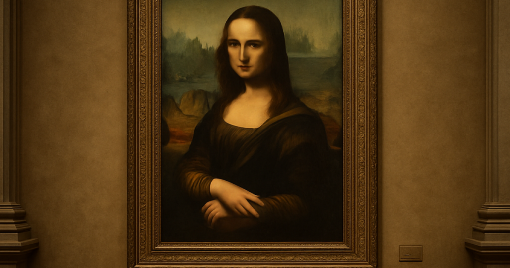
1. Mona Lisa — The Power of Layered Neutrals
Painted by Leonardo da Vinci, the Mona Lisa is known for its soft transitions and muted earth tones.
Color Lesson: Depth doesn’t require bold color. Layering subtle neutrals creates sophistication and timelessness.
Interior Design Takeaway: Grayed greens, warm taupes, and complex neutrals feel richer than flat beige. Consider layered finishes like lime wash or plaster for added dimension.
2. The Starry Night — Contrast Creates Energy
Vincent van Gogh’s The Starry Night uses electric blues and bright yellows in dramatic contrast.
Color Lesson: High contrast generates movement and emotional intensity.
Interior Design Takeaway: A deep navy paired with warm brass or golden wood tones creates dynamic tension without overwhelming a room.
3. The Last Supper — Controlled Composition
In The Last Supper, also by Leonardo da Vinci, color is used to guide the eye toward the focal point.
Color Lesson: Color directs attention.
Interior Design Takeaway: Use deeper tones on built-ins or accent architectural features to anchor a space visually.
4. Girl with a Pearl Earring — Minimal Palette, Maximum Impact
Johannes Vermeer’s Girl with a Pearl Earring relies on a limited palette.
Color Lesson: You don’t need many colors — just the right ones.
Interior Design Takeaway: Color drenching a room in one carefully chosen hue can feel elegant and immersive.
5. The Persistence of Memory — Mood Through Muted Tones
Salvador Dalí’s The Persistence of Memory uses dusty browns and pale blues to create atmosphere.
Color Lesson: Soft, muted tones create emotional mood.
Interior Design Takeaway: Bedrooms and dining rooms benefit from restrained palettes that lean into ambiance rather than brightness.
6. American Gothic — Color and Character
Grant Wood’s American Gothic uses crisp, defined tones.
Color Lesson: Sharp edges and clean contrasts feel structured and traditional.
Interior Design Takeaway: High-contrast trim and millwork create a classic look — especially in colonial or traditional homes.
7. The Birth of Venus — Soft Pastels and Harmony
Sandro Botticelli’s The Birth of Venus blends soft pastels seamlessly.
Color Lesson: Harmony feels calm and cohesive.
Interior Design Takeaway: Rooms that stay within one tonal family feel peaceful and curated.
8. Guernica — The Power of Monochrome
Pablo Picasso’s Guernica famously uses black, white, and gray.
Color Lesson: Monochrome can be more powerful than full color.
Interior Design Takeaway: A black-and-white or grayscale room feels bold and architectural when layered with texture.
9. Water Lilies — Movement Through Repetition
Claude Monet’s Water Lilies series explores subtle shifts within one color family.
Color Lesson: Variation within a single hue adds depth.
Interior Design Takeaway: Using different sheens of the same paint color — matte walls, satin trim — creates quiet architectural contrast.
10. The Night Watch — Light Against Darkness
Rembrandt van Rijn’s The Night Watch uses dramatic light emerging from dark surroundings.
Color Lesson: Strategic contrast creates drama.
Interior Design Takeaway: Deep charcoal or forest green walls paired with intentional lighting create high-impact spaces.
What Famous Paintings Reveal About Modern Color Design
Across centuries, these famous paintings show that:
- Depth beats brightness
- Undertones matter
- Contrast creates energy
- Monochrome can be bold
- Layering builds richness
- Light changes everything
These principles apply whether you’re selecting paint for a living room, refinishing built-ins, or exploring decorative finishes.
The difference between a flat color and a refined one often lies in undertone, sheen, and subtle variation — the same elements master painters understood hundreds of years ago.
Why Studying Famous Paintings Still Matters
The world’s most famous paintings endure not because they’re trendy, but because they understand color at a foundational level.
When you choose paint intentionally, considering lighting, layering, and tonal harmony, you’re applying those same timeless principles in your own home. Great color isn’t accidental. It’s deliberate.