
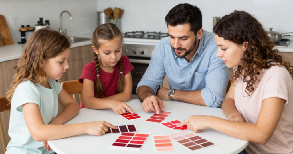
Red paint is one of the most impactful and expressive color choices in interior design. It can feel warm and inviting, dramatic and formal, or bold and contemporary depending on the shade and how it’s coordinated with surrounding colors.
Because red is such a strong color, success depends heavily on pairing it with the right trim colors, neutrals, and accent tones to create balance rather than overwhelm the space.
Understanding Red Paint Undertones
Not all red paints behave the same way. Undertones determine whether a red feels warm, muted, or intense. Understanding the undertone of red paint is critical for coordination.
Warm Reds
- Orange or terracotta undertones
- Feel cozy, traditional, and earthy
- Often used in dining rooms or rustic spaces
Cool Reds
- Blue or berry undertones
- Feel richer and more formal
- Common in historic or elegant interiors
Deep Reds
- Highly saturated and dramatic
- Create bold focal points
- Best used intentionally as accent colors
Coordinating Red Paint With Trim
Trim selection is especially important with red because it controls how intense the color feels in a space.
Red With White Trim
White trim is the most common pairing with red walls. It creates contrast and helps define the space. It is best for dining rooms, entryways, traditional interiors. Popular Benjamin Moore whites include:
- White Dove OC-17
- Chantilly Lace OC-65
- Simply White OC-117
Red With Cream or Warm Trim
Creamy trim softens red and creates a more traditional, layered look. It is best for historic homes, classic interiors, and cozy spaces. This pairing feels more blended and less stark than pure white trim.
Red With Dark Trim
Pairing red with deep browns, charcoals, or black accents creates a dramatic, high-contrast aesthetic. Dark trim is best for formal dining rooms, moody interiors, and accent walls. This approach emphasizes richness and depth.
Coordinating Red Paint With Other Colors
Red works best when balanced carefully with supporting tones.
- Red + White: A classic, high-contrast combination that feels bold and timeless.
- Red + Beige: Softens red and creates a warm, traditional palette.
- Red + Black: Creates a dramatic, luxurious, and formal look.
- Red + Green: A high-contrast complementary pairing often used in traditional or holiday-inspired interiors.
Whole Home Red Color Flow
Red is typically best used as an accent rather than a dominant whole-home color, but it can still be integrated thoughtfully. Tips for using red in a home:
- Limit red to specific focal rooms or features
- Repeat subtle red accents in décor or textiles
- Balance red with neutral surrounding spaces
- Use lighting carefully to control intensity
- When used strategically, red adds warmth and personality without overwhelming a home
Popular Benjamin Moore Red Paint Pairings
- Heritage Red 2084-10: Deep, traditional red. Works well in dining rooms and historic interiors.
- Caliente AF-290: Bold, modern red. Strong statement color for accent walls or doors.
- Dinner Party AF-300: Rich, dramatic red. Ideal for formal spaces.
- Million Dollar Red 2003-10: Classic, saturated red. Works well in traditional design schemes.
These reds vary from bold modern statements to timeless historic tones.
Common Mistakes When Coordinating Red Paint
- Using red in rooms without enough natural light
- Pairing red with clashing undertones in neutrals
- Overusing red throughout multiple rooms
- Ignoring how lighting affects intensity
Red is powerful and must be balanced carefully to avoid overwhelming a space.
Final Thoughts
Visit any Loconsolo Paints location near you to explore Benjamin Moore red paint colors, samples, and finishes. Our knowledgeable team members are ready to help you choose the perfect red and coordinating palette for your space.