
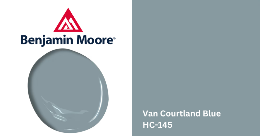
Benjamin Moore Van Courtland Blue HC-145 is a timeless blue-gray paint color known for its historic character. Part of the Benjamin Moore Historical Collection, this muted blue brings depth and sophistication into a space while remaining calm and versatile.
Unlike brighter blues that can feel bold or coastal, Van Courtland Blue has a smoky muted quality that makes it feel refined and livable. It works especially well in homes that blend traditional and modern design elements, making it a popular choice in neighborhoods throughout Queens and Brooklyn, including Astoria and Williamsburg.
What Color Is Benjamin Moore Van Courtland Blue HC-145?
Benjamin Moore Van Courtland Blue HC-145 is a medium-toned blue-gray paint color with subtle green undertones. The gray influence softens the blue significantly, creating a color that feels relaxed, mature, and slightly historic.
Depending on the lighting, Van Courtland Blue can appear:
- Muted blue-gray in natural daylight
- Slightly more blue in brighter rooms
- Softer and smokier in lower-light spaces
- Faintly blue-green in certain lighting conditions
Benjamin Moore Van Courtland Blue Undertones
Van Courtland Blue features:
- Blue undertones
- Gray undertones
- Subtle green influences
The gray undertones help tone down the blue, preventing the color from feeling overly bright or saturated. In some spaces, especially alongside warm woods or greenery, the soft green influence becomes more noticeable. This complexity gives Van Courtland Blue a layered appearance throughout the day.
Benjamin Moore Van Courtland Blue LRV
Van Courtland Blue has an LRV of 31.58, which is considered a medium-depth paint color that offers noticeable richness while still maintaining softness.
In bright spaces, the color feels lighter and airier. In darker rooms, it takes on a moodier and more dramatic appearance.
Where Does Van Courtland Blue Work Best?
- Living Rooms: Van Courtland Blue creates a calm and sophisticated backdrop for living rooms, especially when paired with layered neutrals, warm woods, and traditional millwork.
- Dining Rooms: Its muted richness makes it an excellent choice for dining rooms where a refined and slightly dramatic atmosphere is desired.
- Bedrooms: The soft blue-gray undertones help bedrooms feel relaxing and comfortable without becoming too dark or cold.
- Offices & Built-Ins: Van Courtland Blue works beautifully on home office walls, built-ins, cabinetry, and accent walls. In homes throughout areas like Forest Hills and Sheepshead Bay, muted historic blues continue to remain a popular design choice.
What Colors Pair Well With Van Courtland Blue?
Warm & Historic Whites
- Benjamin Moore Navajo White OC-95
- Benjamin Moore Mascarpone AF-20
- Benjamin Moore Steam AF-15
Rich Coordinating Neutrals
- Benjamin Moore Kingsport Gray HC-86
- Benjamin Moore Alexandria Beige HC-77
- Benjamin Moore Smokey Taupe 983
Accent Colors
- Rust tones
- Muted olive green
- Deep espresso brown
- Antique gold accents
Wood & Metal Finishes
- Cherry wood and medium walnut tones
- Unlacquered brass, antique bronze, aged iron finishes
- Natural linen textures.
Final Thoughts
If you’re considering Van Courtland Blue for your next painting project, visit one of our paint shops to speak with our paint experts, explore Benjamin Moore samples, and find the right products for your home.