
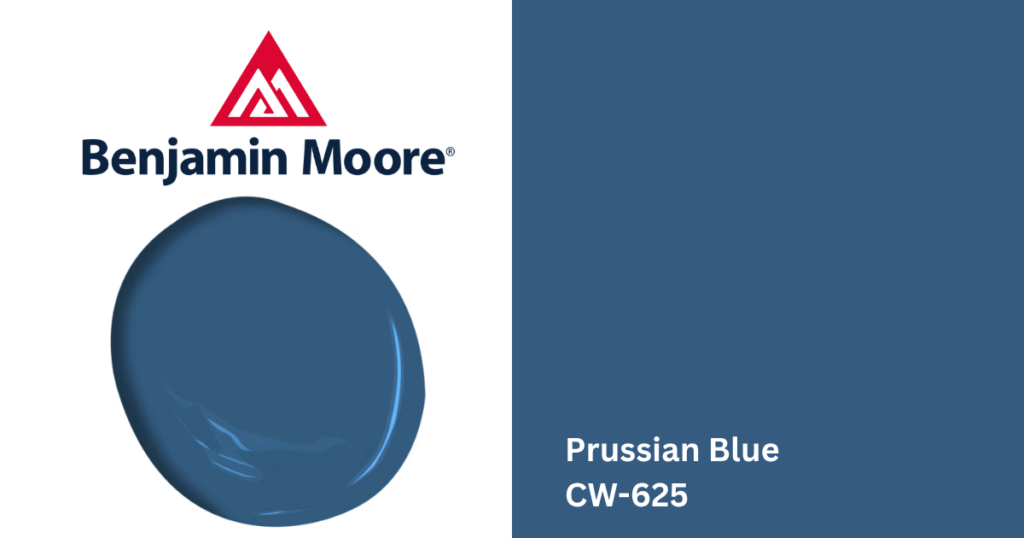
What Color is Benjamin Moore Prussian Blue?
Benjamin Moore Prussian Blue (CW-625) is a rich, historic blue with remarkable depth and elegance. Part of the Williamsburg Collection, this striking color was inspired by the famous 18th-century pigment known as Prussian blue and reflects the timeless beauty of blue-and-white Chinese export porcelain.
Unlike brighter navy blues or muted blue-grays, Prussian Blue delivers a refined, saturated appearance that feels both dramatic and sophisticated. It works beautifully in traditional homes but is equally at home in modern interiors where a bold, timeless statement is desired.
Color Details
- Color Name: Prussian Blue
- Color Code: CW-625
- Color Family: Blue
- LRV: 12.17
With an LRV of 12.17, Prussian Blue is a dark paint color that absorbs a significant amount of light, creating rich contrast and a dramatic presence.
What Are Prussian Blue’s Undertones?
Prussian Blue has deep blue undertones with subtle gray influences that give it a sophisticated, historic character rather than a bright or vibrant appearance. Its undertones include:
- Rich navy blue
- Soft gray influence
- Slight cool cast that adds depth
Lighting will affect how the color appears:
- In bright natural light, more of its classic blue character is revealed.
- In north-facing rooms or lower light, it becomes moodier and more dramatic.
- Warm artificial lighting can soften the color slightly while maintaining its rich depth.
Is Prussian Blue a Warm or Cool Color?
Prussian Blue is considered a cool paint color. Its blue foundation creates a refined atmosphere while its depth adds warmth through visual richness rather than yellow or brown undertones. This makes it an excellent choice for creating intimate, elegant spaces.
Where Does Prussian Blue Work Best?
- Living Rooms: Prussian Blue creates an elegant backdrop for living rooms, especially when paired with lighter furnishings and natural textures. It complements cream upholstery, warm wood furniture, layered textiles.
- Dining Rooms: This is one of Prussian Blue’s strongest applications. Its rich depth creates an intimate atmosphere that feels both classic and luxurious. It pairs beautifully with traditional millwork, antique furnishings, statement lighting.
- Home Offices & Libraries: Prussian Blue adds focus and sophistication to workspaces and reading rooms. Its darker tone helps create a comfortable, grounded environment while adding architectural interest.
- Kitchens & Cabinetry: Prussian Blue makes a stunning cabinet color for homeowners looking beyond traditional white or gray. It works especially well on kitchen islands, full cabinetry, and built-in shelving.
Coordinating Colors for Benjamin Moore Prussian Blue
Warm Whites & Off-Whites for beautiful contrast against Prussian Blue’s richness:
- Decorator’s White (OC-149)
- White Dove (OC-17)
- Swiss Coffee (OC-45)
Neutral Pairings for a balanced palette, consider:
- Harwood Putty (CW-5)
- Finnie Gray (CW-55)
- Pale Oak (OC-20)
Accent Colors for additional depth and contrast:
- Blue Heather (1620)
- Kendall Charcoal (HC-166)
- October Mist (1495)
What Style Homes Work Well With Prussian Blue?
Prussian Blue is especially well suited for Colonial, Federal, Georgian, Traditional, and Historic homes, though it also works beautifully in transitional and modern interiors. Its timeless character makes it an excellent choice for homeowners looking to introduce bold color without sacrificing sophistication.
Can Prussian Blue Be Used on Exteriors?
Yes. Prussian Blue is an excellent exterior color for front doors, shutters, and architectural accents. It can also work as a full-body exterior color on traditional-style homes when paired with crisp white trim and complementary stone or brick.
Visit Loconsolo Paints for Expert Color Help
Whether you’re considering Benjamin Moore Prussian Blue or comparing it with other rich blues, visit one of our Loconsolo Paints stores in The Bronx, Brooklyn, and Queens to see the color in person.
Our knowledgeable team can help you evaluate undertones, lighting, finishes, and coordinating colors so you can choose the perfect Benjamin Moore paint with confidence for both DIY and professional projects.