
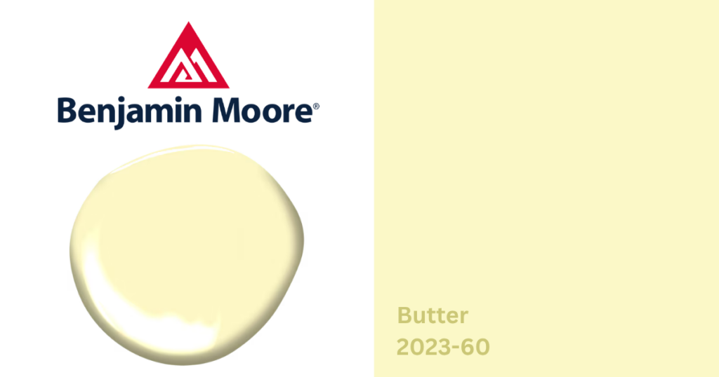
What Color Is Benjamin Moore Butter?
Benjamin Moore Butter (2023-60) is a light, creamy yellow that brings warmth and optimism to a space without feeling overpowering. Its soft, sun-kissed appearance adds just enough color to brighten a room while maintaining a timeless, comfortable feel.
Unlike bold yellows that demand attention, Butter is subtle and inviting. It works well for homeowners who want to introduce warmth into their home while keeping the overall palette light, airy, and easy to decorate around.
Color Details
- Color Name: Butter
- Color Code: 2023-60
- Color Family: Yellow
- LRV: 85.57
With an LRV of 85.57, Butter reflects a significant amount of light, making it an excellent choice for brightening darker rooms and creating an open, welcoming atmosphere.
What Are Butter’s Undertones?
Butter has soft golden-yellow undertones that give it warmth without becoming overly saturated. Its undertones include:
- Gentle creamy yellow
- Soft golden warmth
- A subtle sunlit quality that keeps the color feeling cheerful
Lighting has a noticeable effect on Butter:
- In bright natural light, it appears fresh and sunny while remaining soft.
- In north-facing rooms, the warmth helps offset cooler light.
- Under warm artificial lighting, Butter becomes even cozier and more inviting.
Is Butter a Warm or Cool Color?
Butter is a warm paint color. Its yellow base naturally creates a welcoming atmosphere that works well in homes where you want brightness without the starkness of white. Warm colors like Butter can make spaces feel more inviting while pairing beautifully with wood furniture and natural materials.
Where Does Butter Work Best?
- Living Rooms: Butter creates an uplifting yet understated backdrop for living spaces. It pairs beautifully with: light oak furniture, linen upholstery, woven textures, and natural greenery.
- Bedrooms: For bedrooms, Butter offers a softer alternative to white or beige. Its warm character creates a relaxing environment that feels cheerful during the day and cozy in the evening, especially when paired with crisp white bedding and warm wood furniture.
- Kitchens & Cabinets: Butter is a natural fit for kitchens where light is a priority. It works especially well on kitchen walls, pantries, and built-in cabinetry. The color complements white cabinetry, butcher block countertops, and brushed brass hardware.
- Bathrooms: Butter can help smaller bathrooms feel brighter and more welcoming. It pairs nicely with white subway tile, marble countertops, and soft white towels.
Coordinating Colors for Benjamin Moore Butter
Warm Whites & Off-Whites for a soft, layered palette, consider:
- Benjamin Moore Mascarpone (AF-20)
- Benjamin Moore Bavarian Cream (2146-70)
- Benjamin Moore White Dove (OC-17)
Balanced neutrals for a gentle contrast, consider:
- Benjamin Moore Silver Marlin (2139-50)
- Benjamin Moore Pale Oak (OC-20)
- Benjamin Moore Edgecomb Gray (HC-173)
Accent Colors for added personality and richness, consider:
- Benjamin Moore Deep in Thought (AF-30)
- Benjamin Moore Hale Navy (HC-154)
- Benjamin Moore October Mist (1495)
What Style Homes Work Well With Butter?
Butter is a versatile choice for cottage, farmhouse, traditional, transitional, and vintage-inspired homes. Its soft warmth also makes it an excellent option for homeowners looking to brighten interiors while maintaining a timeless, classic aesthetic.
Can Butter Be Used on Exteriors?
Benjamin Moore does not recommend Butter (2023-60) for exterior use. Its soft, light yellow was designed for interior applications where its warm character can be fully appreciated.
Visit Loconsolo Paints for Expert Color Help
Whether you’re considering Benjamin Moore Butter or comparing it with other warm yellows and neutrals, visit one of our Loconsolo Paints neighborhood paint stores to see the color in person.
Our trained team can help you evaluate undertones, compare coordinating colors, and choose the right Benjamin Moore products and finishes for your project, whether you’re painting a single room or your entire home.